Friday, February 27, 2009

Edgy, revisited on past pics.

                           "Badlands Dry"  Badlands, South Dakota., U.S.A.

So along with us learning about HDR's (see previous blog) we also learnt how to do "Edgy" photo's by manipulating an image in Lightroom. I got to thinking about it and wondered if maybe my holiday pics from this past summer's trip to South Dakota and some pics from the Lake could be somehow improved or made more interesting by doing an "Edgy" technique to them. I found the ones that seem to work the best are those with "texture" ie. wood, hair, grass, feathers, etc.  I only got my Cannon 40D at the end of July so that was about as far back as I could go.( I was all about film until then.) It was cool to change them up and it was especially kind of sentimental reliving the highlights by looking at the pics again. It sure helps when the snow is still falling and the temps. are a "balmy" -38C - Think warm thoughts, we'll get through this!


                                                     "Wash Station" 1880's town.

                                                     "Signs" 1880's town.

                                     "Sitting on the Dock at the Bay"  Sammy  

                              "Bird on Perch" Reptile Gardens, South Dakota. 

Tuesday, February 24, 2009

No one person should have this much fun!

Above: HDR Livingroom
Below: Middle exposure livingroom.

2 weeks ago we learnt something really neat in digital techniques. HDR's also known as High Dynamic Range photo's. TOOO MUCH FUN!!! One essentially finds a situation to photograph, the best, being one of dark shadows and highlights. You then find your top highlights exposure image and your lowest shadows exposure image( Use your histograms photographers) and then combine all the images inbetween the two together using photomatix program. My images were made from about 15 exposure images each. It gives a real cartoon appearance to the images. I loved working on this- I'm always looking for new locations to try this technique on.
I've given you the HDR version and then just the middle exposure image of the photo so you can see the change. Enjoy!


"In Storage"

"Artist Alley"


"Downtown Winnipeg from the Forks"


"HDR Painting"

Saturday, February 21, 2009

Palm Trees meet Mountains.

I'm back....! I decided to take this "shoot week" and do some traveling, in an effort to work on some portfolio picks. I also looked at it as an exploratory time of what I find interesting subject matter.  Palm Springs, California it was! It's an amazing environment of everything from Palm trees to mountains. Subject matter ranges from golf courses (sports) to incredible sunsets, desert landscapes and lush greenery. I found myself "shooting" just about everything I saw, here is a few of the highlights....

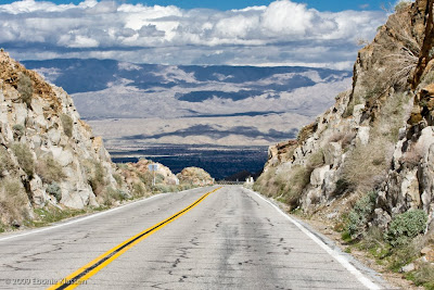
My friend Laurie took me on a scenic ride up the mountains to overlook Palm Springs.


Water was always a great subject matter as every corner appears to have fountains and every closed community has their own beautiful water display as you enter the gates to the communities.

Fruit trees just appear at random, Grapefruit, oranges, lemons. In the community where I stayed, you could pick fruit any time you liked.... and it was goooooood!  

I did a little tourist stuff, like visiting the Living Desert. Below is a shot in the "Oasis".

 The Living Desert also had great desert gardens that you could walk thru.


Flowers where everywhere....


and I even had time to explore the game of golf... I went along with my friend Laurie. We were put together with a great couple from Alberta and they where great sports about me taking pictures- They even enjoyed it. Think about it -how many people spend holidays golfing but have no pictures to show for it- Hummmm, I wonder if there is a business opportunity there somewhere???


Meet Linda and Alan - Yes, me taking pictures of stranger's,  I think that was somewhere in the assignments for this week.... boy, those assignments seen so long ago!


Desert Falls golf course below.


El Paseo, the best shopping in town- unfortunately  no paparazzi- like opportunities presented themselves.


Lunch at the Indian Wells golf course. A little "edgy" work in lightroom.


Okay- their bathroom was incredible- oh, the light!


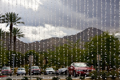
Curtain of water- shot as the valet pulled up the car for us, as we concluded lunch... ah, the life! To bad we all have to come crashing back to reality sometime! Back to school assignments!


Sunday, February 15, 2009

Movie review 3: Beware of sweet girls offering advice at the video store!

 Cast iron plant holder with mini roses. Forgive the bad editing job- I'm still learning Lightroom and was playing around with this image to give you kind of an idea how somewhat the movie 300 looked the entire time viewing it. The cast iron planter resembles the feel of the  Spartans shields and the red roses were like the Spartan's capes.

Okay, it's Valentines evening and my husband and I enjoy a nice dinner out and then we decide to, instead of going out to a movie, to rent a movie.  I know I have to complete this movie review assignment in school before I leave for Palm Springs tomorrow. My husband and I are "rummaging around" in the video store looking for a unique flick that has some relation to photography or cinematography. I'm looking for "Pleasantville", as someone had suggested. I go to ask if they have it and the girl says "sorry we don't have that one".  Completely perplexed I go wondering the shelves once more looking. I notice the movie Sweeny Todd ,  I think - hey it's a musical, looks like they've done something to it photographically, maybe it's an option!  My hand no sooner touched the case and a sweet looking employee says to me :

" If you're looking for something unique with cinematography- you should try "300"."
Me: "Oh really?"
Her: "Yeah, I don't think you'll like Sweeny Todd, I had to see the movie twice in the theater because I couldn't stomach the blood the first time." 
Me: " Wow, that bad, eh?"
Her: " Ya, 300 has really cool CG graphics and the blood doesn't seem as real."
Me: "Oh??" ( I'm trying to figure out what CG means quite quickly)
Her: " Yeah, there is a special feature where they talk about how the movie was made in it as well." ( I'm thinking she recognized the perplexed look on my face  as to what CG meant).
Me: "Okay, I'll take it ???? ( I was still obviously obsessing about what CG meant and totally missed the part about blood.)

The only thing I have to say after viewing the movie was that red roses, wasn't the only red thing I saw on this Valentines day! The movie is a story about King Leonidas and 300 Spartans in a retelling of their heroic battle of Thermopylae against the Xerxes and his Persian army. I love Greek history, but the war part was a little much. The cinematography was really cool I must admit. The film basically uses a desaturated/ high contrast feel to the movie to make it appear as a graphic novel. I think their choice to film/edit this way was wise. It really emphasized  the metal of their helmets and shields, which I found out later were actually plastic. They also used this desaturated background as a backdrop to emphasize the red in the warrior's capes. The contrast levels where superbly used in the clouds to create drama and an atmosphere of foreshadowing (guess who dies). The contrast also works to emphasize the physique of these men who were raised only to be soldiers, and how important that (physical perfection)  was to the Spartan formation techniques in times of war.  The special feature was a little slow- 4 guys who made the movie, talking while the movie is playing-( Great you get to watch it all over again). Who knows- I did learn the shields where plastic! And better yet, I learned what CG, CGR, and ADR all stand for!

I would rate this movie as a 2.5, for cinematography and special effects 4 (anyone who can take 6 actors and make them look like an army deserves at least that), and a 0 out of 5 for a Valentines movie with your sweetheart!

Friday, February 13, 2009

Carolyn and Carter

Meet Carter.
I had a fun day yesterday working on my IS portraiture assignment. I had to photograph a couple of people I did not know. In steps Carolyn and Carter. I know Carolyn from high school but Carter,  her son, I did not know till yesterday. I wish I would have met the child sooner- what a great personality! He was a lot of fun photographing- and very photogenic. Some people like him and his mom can portray emotion well through the lens. We tried a number of different head shots creating different personas with props, lighting, and different backdrops in the studio. I then combined what we learned in Digital Techniques and put an "edgy" spin on some of his photos playing with them in Lightroom.  I think it gives a different feel to the teenager portrait- it might even make having a portrait taken, a little more fun! Thanks guys!

"Edgy" Lightroom manipulated photos of Carter above and below.
Carter the musician below.
Carter the "Edgy" BB player below.
Carter and Carolyn below.
Carter showing his BB skills.

Carolyn.

Meet Fred

Slowly but surely I'm getting around to photographing all my class mates. This blogs about Fred- okay maybe not. This blog is about the day I photographed Fred. We had Industry Studies with Craig and you guessed it it was all about portraits. Our mission for this class was to take about 10 min., work with what our subject had on, and we were assigned a spot at school, and one light. I could see Fred had a lot of potential to be.... I don't know let's see, I had a metal background, or an orange wall as my background and He was wearing a hoody and sporting the start of a beard.... maybe a boxer, a wrestler, someone who was a champ, a rapper/musician?  The point was to create this persona with our subject and make it happen. 
I think the results were successful- Fred was a great sport about it all. My son's wanted to know when his C.D. was coming out.(they thought the top photo looked like a C.D. cover). 


Thursday, February 12, 2009

Movie review 2: Painting with pixals to create-Sepia?

                               Gull Lake, 08 view from the water. I choose to manipulate this photo to desaturate it so as to create a more rustic feel to it. To portray to the viewer the "kickback, no worries, enjoy nature feel" of the Lake.

The second of my 3 part movie review is that on, O Brother, Where Art Thou, starring Georgee Clooney, John Turturro, Tim Blake Nelson, with John Goodman. It won an Academy award for best cinematography (Roger Deakins). The movie is a slow moving adventure, where 1 inmate, Ulysses Everett McGill, escape from a Mississippi prison. Crush rocks all day is what they do there. He escapes dragging along 2 other inmates, Pete and Delmar,  for an adventure( because they are chained together). He tells them they are going on a treasure hunt and their adventure begins. They encounter a river baptism, record an album,( in the middle of no where), meet some "sirens" at the river and go along for a bank robbery with a bank robber. Their luck seems to have no bounds and somehow in the end they get away with it all. I probably would have appreciated the humor in it more if I could have understood the thick drawl of the actors. The music was unique, and I was mildly surprised when my 15 year old said he liked it.
The amazing part of the movie was it's cinematography. The entire film was created using a digital process to desaturate the film. The film has bonus features, one which is "Painting With Pixals" in which they talk about the process they used. They suggested that desaturated the film and balancing the tones in the scenes , gave them the flexibility to shoot the scenes at different times of the day, year , etc. . The purpose of desaturation, to almost a Sepia, was to create the
"Dustbowl" feeling of the time period the movie is to portray. They felt they could not convey those types of feelings in other ways. If you are into gadgetry, or How-do-they- do- that moments, this little extra bonus would be of great interest to you! I would give this movie a 3.5 out of 5 and a 5 for it's cinematography.

Tuesday, February 10, 2009

Movie review 1: Colours for feelings-Creating mood

So this is going to be one of 3 highly  unusual blogs from me. Our school is going into "shoot week" where we don't have regular classes but work on projects. One of our projects this week is to do 3 movie reviews on movies selected in their relation to photography. My first movie was One Hour Photo with Robin Williams in it. So here is my review:
Gone is the childhood funny memories of "Mork and Mindy".  Robin Williams takes a HUGE step away from his regular funny/comedic roles to play a "psychotic" film development manager at a large retail store. He lives vicariously(actually envisions himself as a family member) through the photos brought into him by a family to develope. Everything is going fine until he discovers that the husband is involved in an extramarital affair and his illusions about being part of this perfect family are thrown in a tailspin. This combined with his dismissal from his place of employment leads him on a  rip, roaring, camera rampage. (Who needs a gun when you have a camera). We've also heard of the might of the pen, but the camera in this case, may be mightier!
Content aside,  I see this movie as a study in tones and color saturation and their relevance to creating mood and suspense in the movie. I loved the way the cinematographer used color in this film to convey a message to the viewer about the mood of the scene or that of the character. For example, when the main character is at work, the store always seems bluish white. The grocery shelves,  on the other hand are stalked with product that showcase as a massive blur of orange , yellow, blue and green. I saw this as a suggestion that perhaps the main character is cold and isolated from the real world and the real world is the colorful stuff on the selves. WAIT- I've been there before- Those colors, that feeling-  Sometimes as a housewife, and mom , you tend to feel a little isolated from the world especially if your a stay at home mom. I can remember times going to my monthly excursion into the real world of- Walmart! Even with the people all around, I would still feel alone. I'd walk by a mirror and peer into it and not recognizing myself in the bright florescent lights. Who was that pale, bluish, washed- out women in front of me- where was her life? The bright products seemed as though to mock me from their selves promising  life-  A life of cleaning, cooking, baking, repairing, painting..... Okay enough theatrics......
 And then I got to thinking(Cause my mind seems to do that once-in-a-while) And then my brain did the other thing it does once -in-a-while and it began to make an association between what I was doing at the time and this movie review. A big huge lightbulb goes on in Ebonie's brain. Photographing some items around the house and playing with a few tools in Lightroom, perhaps I could convey those same colors/feelings in the movie?  It somehow seemed easier to explain the color changes in the movie with an actual photo, maybe even a little more interesting? 
A little disclaimer here, The condition of the laundry is in no way a reflection of any of the cleaning products indicated in the photo's OR my abilities as a laundress. I love Tide, I've used it all my life -it's all good.... 
Two things drew me to shoot these photo's this way:
1. I was multitasking -Laundry day and homework
2. It just happened to be what I had in the house that was colorful enough.

 Above:Here is the feeling I got when the main character was a work:Blue/white, cold isolated.   But still dynamic, saturated color around him. Examples are when he meets the boy in the store toy area. The boy is dressed colorfully and he is his blue/gray/white self. Also his customers always appear in colorfully saturated clothing as well. I found it interesting as well at the end of the flick, that the interrogation room was also Bluish/white with but one shot of red- a chair in the room. 

 Every time He got into his vehicle and ventured outside his residence or place of work the scene become a mass of green/yellow hues. I'm not sure what feelings those colors conveyed but I got a sense of discomfort. Maybe it was his discomfort I was suppose to be feeling????


When He was reflecting on being part of the family, the scene turned a warmer hue, not bright, just a slight peachy glow. This happened when he was at the restaurant looking at the pictures and even in his home. I may add, his trophy wall of family pics remained saturated and the color diffused further from this wall. This worked well to convey his happiness. 

All in all, I would give this movie a 4 star if your looking at it from a photographer's point of view- a 1 if your just renting it. It's slow,  predictable and I prefer the Robin Williams I grew up with. Oh don't forget,  5 stars for the lady doing the Laundry-Tee- Hee-He!!!